Sombrero Vueltiao
By: Daniel Iván Jiménez
We created this environmental visualization thinking about how we conceive environmental data and its effect on our daily lives.
This representation created in P5 JS shows the changes in temperature, Uv index, and rainfall in 24h in certain locations. Inspired by the traditional Sombrero Vueltiao (turned hat) from Colombia.


OUTCOME
The idea of this project is to propose a form of visualizing environmental data, encouraging people to create their own visual language vocabulary.
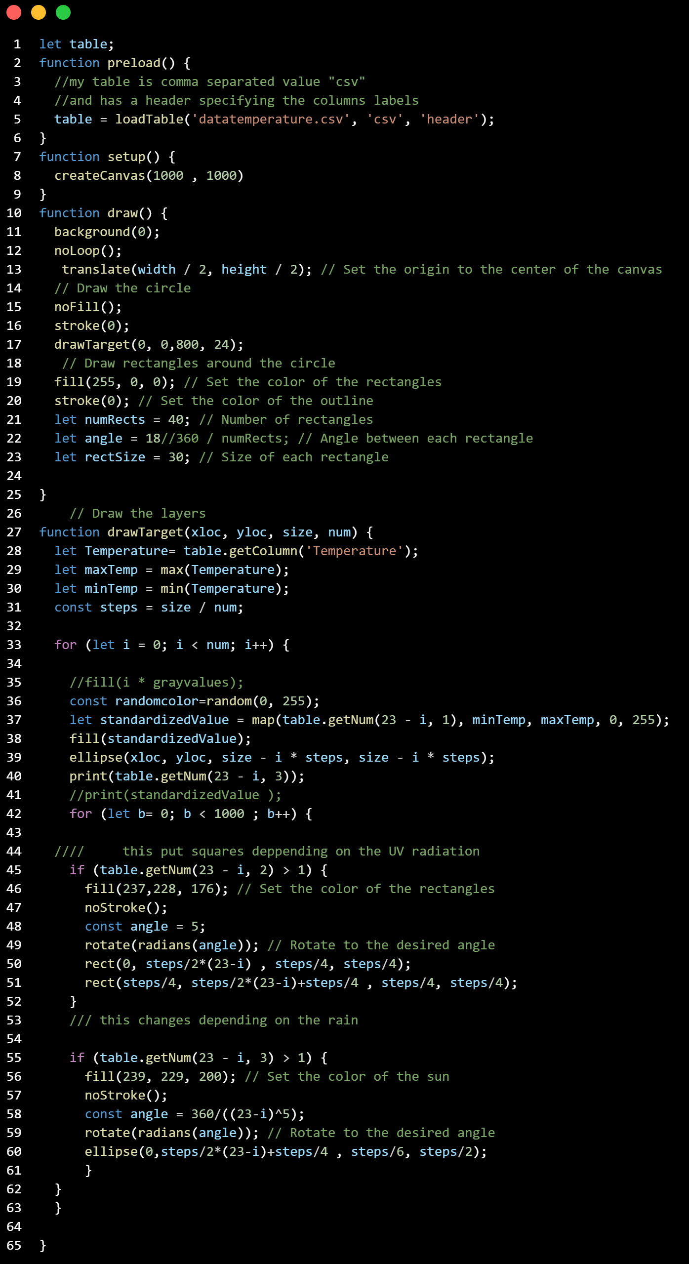
Here there is the commented code, so it is possible to create a visual language by hanging the shapes, forms, and statements in every part of the code.
![]()
The idea of this project is to propose a form of visualizing environmental data, encouraging people to create their own visual language vocabulary.
Here there is the commented code, so it is possible to create a visual language by hanging the shapes, forms, and statements in every part of the code.
VISUAL LANGUAGE
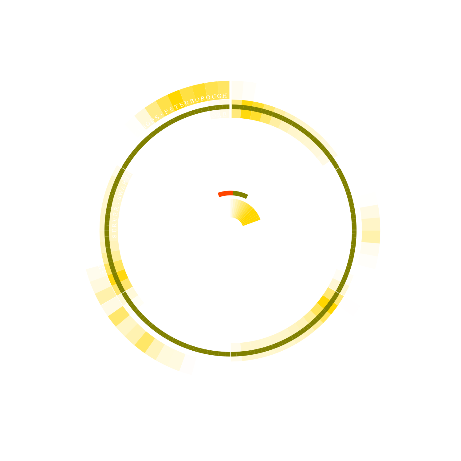
For this visualization in specific, we proposed 4 main sources of visualizing the data:
With circles 24 in total that represents the 24h of the day, starting at 00:00 in the inner circle.
The gradient of color in the ellipsis, changing between white and black, mapping the min and max temperature during the day.
The squares, adding squares where the Uv index was greater than 1.
With ellipses, which represent rainfall.
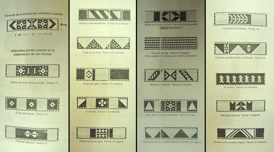
This visual language is inspired by the traditional sombrero vueltiao pintas
![]()
For this visualization in specific, we proposed 4 main sources of visualizing the data:
With circles 24 in total that represents the 24h of the day, starting at 00:00 in the inner circle.
The gradient of color in the ellipsis, changing between white and black, mapping the min and max temperature during the day.
The squares, adding squares where the Uv index was greater than 1.
With ellipses, which represent rainfall.
This visual language is inspired by the traditional sombrero vueltiao pintas


DATA COLLECTION
For this project, we started using the data provided by APIS by
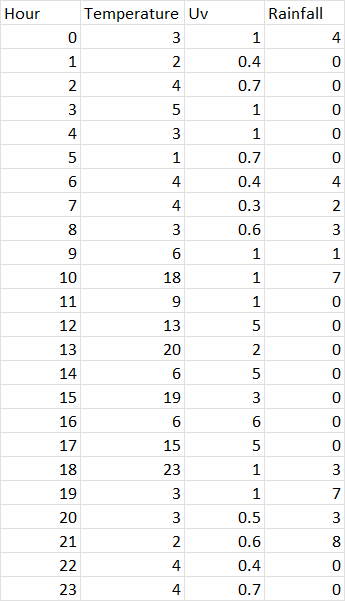
However, for the top visualization, we used the following dataset, in order to create a consistent solid image and accessible data.
![]()
For this project, we started using the data provided by APIS by
Solar Protocol
However, for the top visualization, we used the following dataset, in order to create a consistent solid image and accessible data.
DATA PROCESSING
The data was processed and treated in P5 JS
![]()
The data was processed and treated in P5 JS

DESIGN PROCESS
This project started by understanding the solar protocol data and project and visualizing the importance of the weather conditions in every different part of the world.
We did some research to learn how to visualize environmental and atmospheric data.
First, look at the solar protocol Image, and then, by looking at different ways of visualizing temperature, humidity, and UV index across different tools.
![]()
This project started by understanding the solar protocol data and project and visualizing the importance of the weather conditions in every different part of the world.
We did some research to learn how to visualize environmental and atmospheric data.
First, look at the solar protocol Image, and then, by looking at different ways of visualizing temperature, humidity, and UV index across different tools.


We tried to understand the link between the data and the people, so we studied how the sun affected different areas of the world. Because of our background, we centered our studies in Colombia and recognized the Sombrero Vueltiao as a historic way of visualizing data that also is influenced by the environmental data and history-telling process.